Simplicity
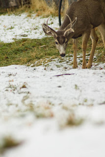
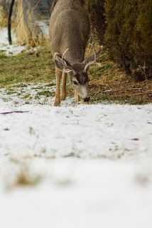
Hey, who is the subject here? There are too many deer and there isn't anything, balance, lines, etc., to help us know who we are supposed to be looking at. Not to mention those trees overhead, there are some other shots I got of these guys that you can't tell the trees from their antlers, this shot is just screaming for some simplicity. The second shot I just got a tighter shot of the one eating the bush. The busy tree is gone and we just have a nice simple background, and a very clear subject. Simplicity can really be powerful sometimes, in this case less was definitely more.
Rule of Thirds
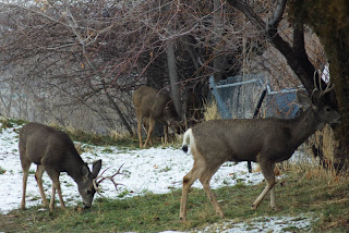
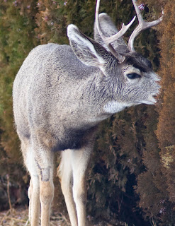
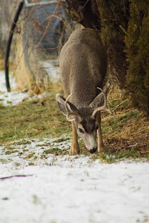
I had a hard time finding a shot to use to illustrate this one. Most of my shots use the rule of thirds, just because it is almost always a good idea. In fact even trying to make this one look bad something kept fitting into a third somewhere. If I was shooting to get a bad one on purpose I probably could have come up with a better example, but this is what you are getting. I don't necessarily think the first one is too bad, but I will try to make it fit here anyway. In the first one we have a line between the white snow and the rest of the shot right down the middle. The deer is also pretty much in the center of the frame, not off to the right or left. In the second one I pulled out a little bit and pushed him just a tad off center. Now the snow is taking up the lower third and the deer has the top two thirds to work with, also note that I didn't put him so low that the action has nowhere to go, he has plenty of frame to look/eat through. Although he probably wouldn't eat any further cause its just snow. Sorry you had to go through this one, I told you it was kind of a stretch. Just watch for all the rule of thirds in the other shots to see how it can help with the picture, like I said it comes up in almost every shot.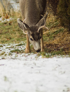
Lines
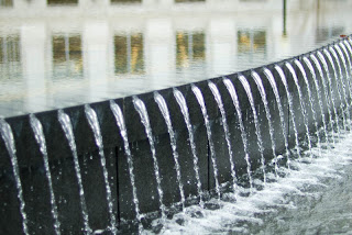
It is hard to come up with a bad example of lines, usually lines are good, and if you don't have lines then usually there are other elements to make it a good shot. You usually don't look at a picture and say, man that shot is horrible there are no lines, so I'll just give you a couple of different types of lines. The first shot is a C-curve. I talked about S-curves before, S-curves can really help out a shot, but C-curves are pretty good too, the path way just curves right around and then leads us up to the building. The second shot is a good example of diagonal lines, those close enough to be diagonal, right? I really like this shot, I spent quite a bit of time playing by this fountain, I never even knew it was there before.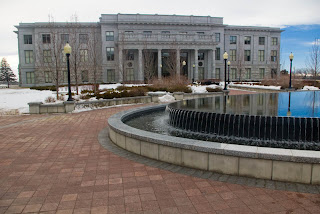
Balance
Blah, how boring can you get, lets just shoot straight down the middle of the arch. The first shot is too symmetrical, this is usually a bad sign, asymmetry is usually more appealing. In the second you can see how I changed my vantage point and took the shot at an angle so it isn't so symmetrical, and hey, here are those darn lines again, the different railings on the floors lead us right down the main hallway. I threw in a bonus shot here for you, the balance of the different heights in the building will help lead your viewer to the subject as well. Those tall buildings just lead us right to the capitol building.


Framing
I have to admit, I didn't really think much about framing when taking my shots, so these aren't the best examples in the world, in fact I don't like either of these shots, but the framed shot does look a little better than the non-framed shot. The first one, no framing, just a boring old building, the second has the lamp and the other building to frame the capitol building for us. Not to mention the different levels on the building to the right have leading lines, as well as the pole going up, that direct us to the capitol.

Mergers
Okay, here are my merger shots. If you notice in the first picture something is coming out of the deer's head, I moved to shift my view and now the deer looks less distracting. Although I like the top one better if you are looking at it from a rule of thirds standpoint, in both the deer is in the top third, but in the first he is also off to the right rather than right in the middle.